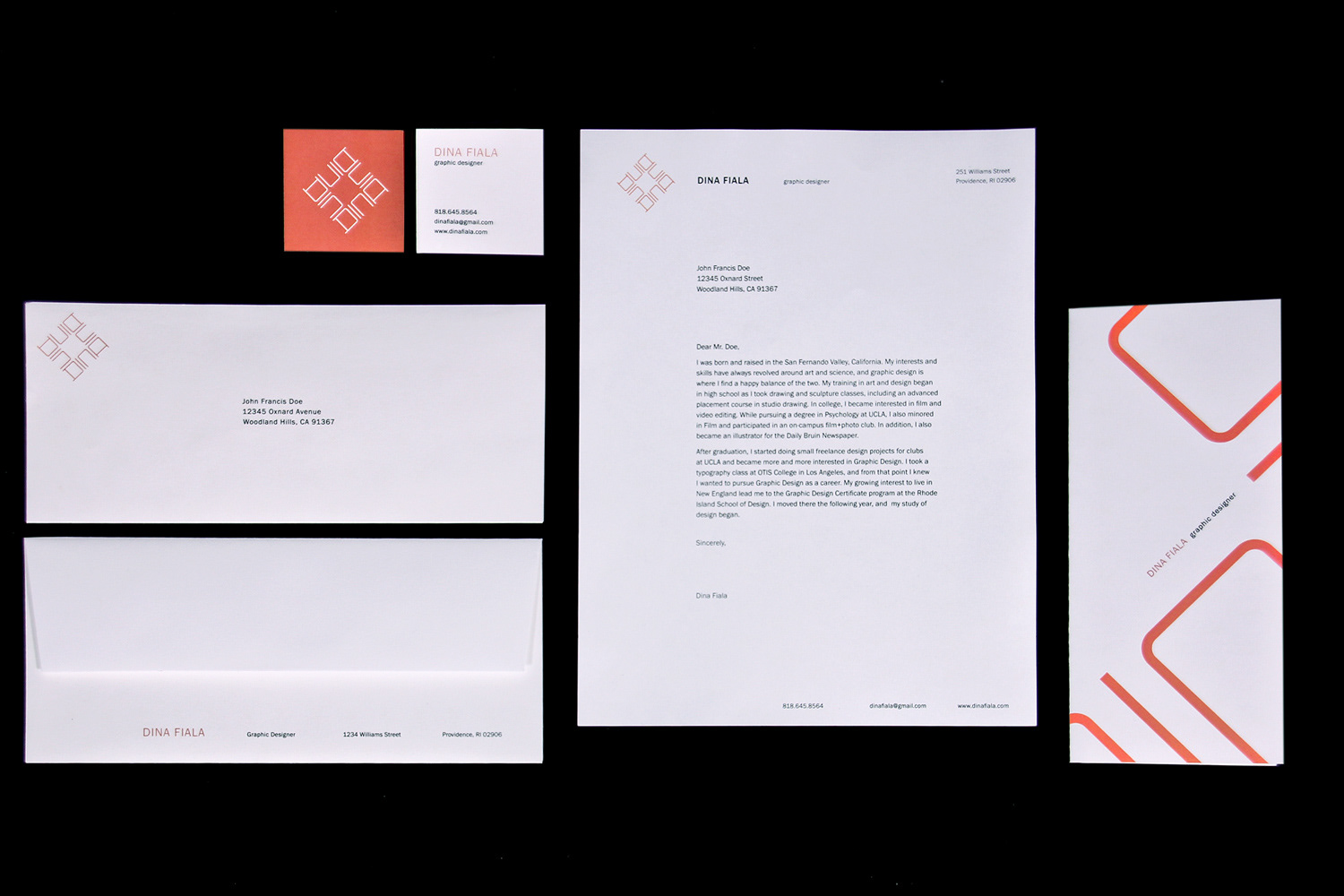
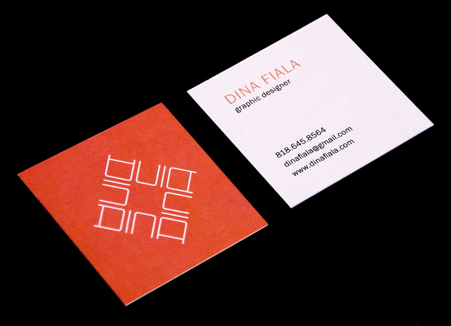
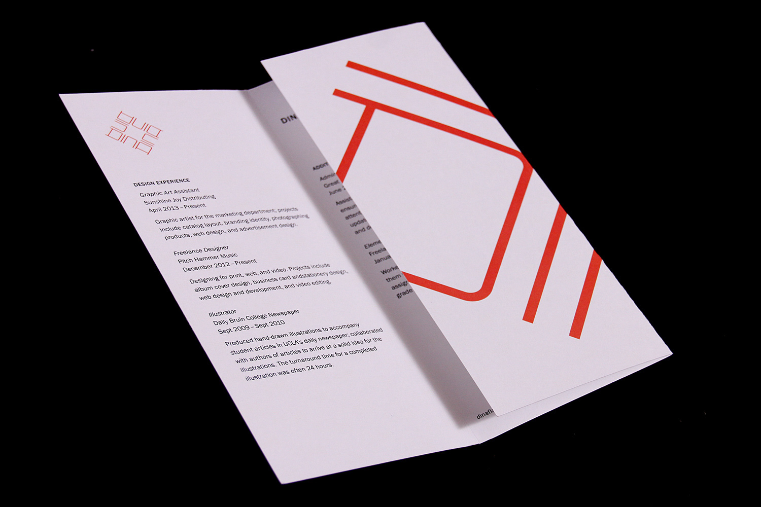
Personal Identity Design
Typeface family: Franklin Gothic
Typeface family: Franklin Gothic
This is my personal identity design. My process began with brainstorming and mind mapping the subject of myself, and the concepts I arrived at were logic and observe.
After many sketches and more brainstorming, I arrived at my symbol. The symbol consists of the letters in my first name, duplicated and rotated to make the four sides of a diamond. Logic comes into play at the corners of the diamond, where the letters D and A are represented by the same form, but rotated 90 degrees. This demonstrates what I strive to bring into my designs, connections among imagery and symbol that provide deeper meaning. The symbol also depicts a stylized iris of an eye. This illustrates the aspect of my designs in which the observations of the world around me come into the process.
The typeface family chosen for my identity is Franklin Gothic. I feel that this transitional sans serif is an appropriate pairing to my symbol in that is possesses both human and geometric qualities. My color choice for the identity is a coral orange. I chose this color to reflect my personality. I am a happy and positive person who loves Southern California sunsets.
Rhode Island School of Design
Graphic Design Certificate Program, Division of Continuing Education
Dina Vincent, Instructor + Program Advisor
Graphic Design Certificate Program, Division of Continuing Education
Dina Vincent, Instructor + Program Advisor
Photos by Allan Millora Photography