Sustainable Energy Newsletter
Printed on newsprint by Newspaper Club
Typeface family: Franklin Gothic
Printed on newsprint by Newspaper Club
Typeface family: Franklin Gothic
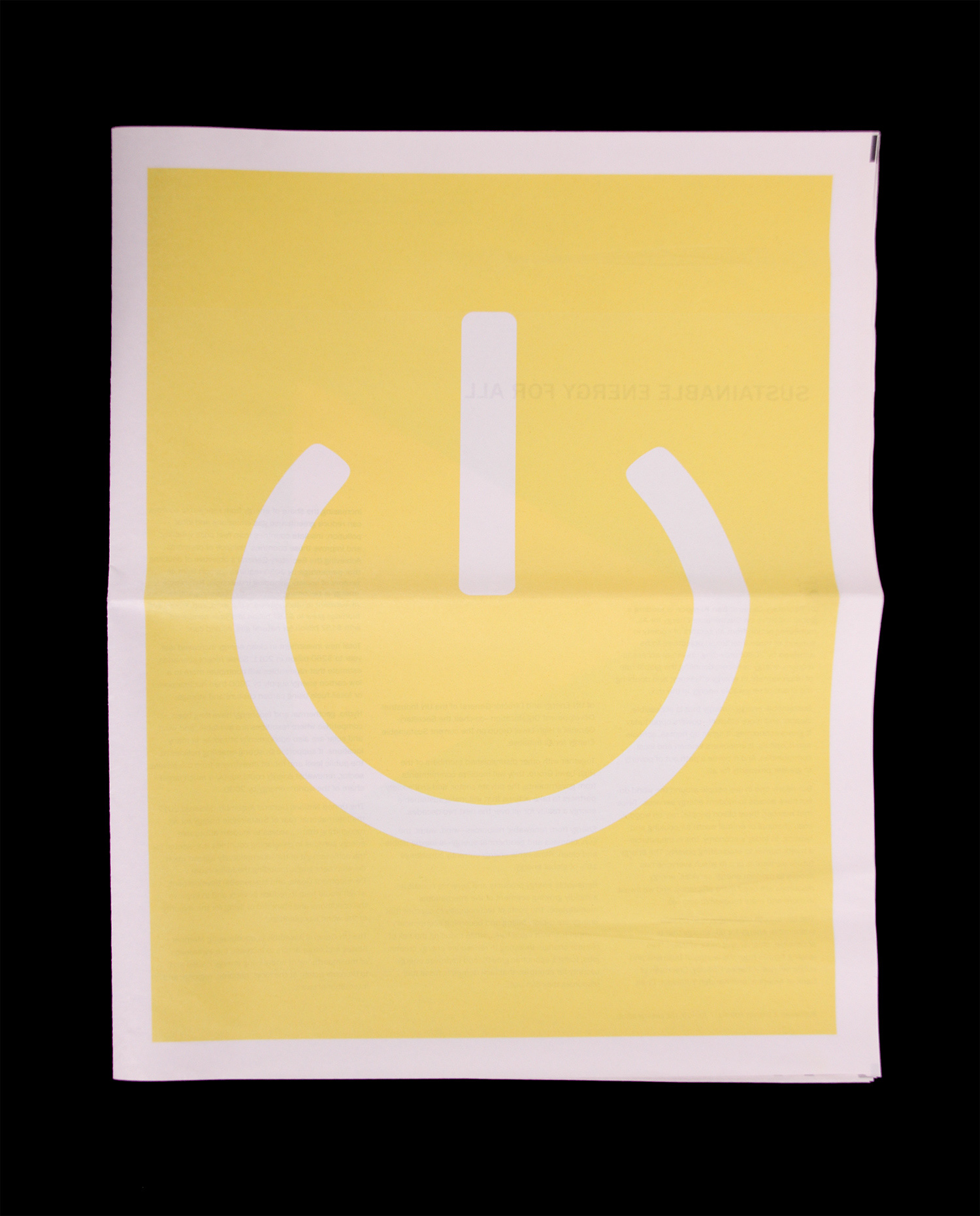
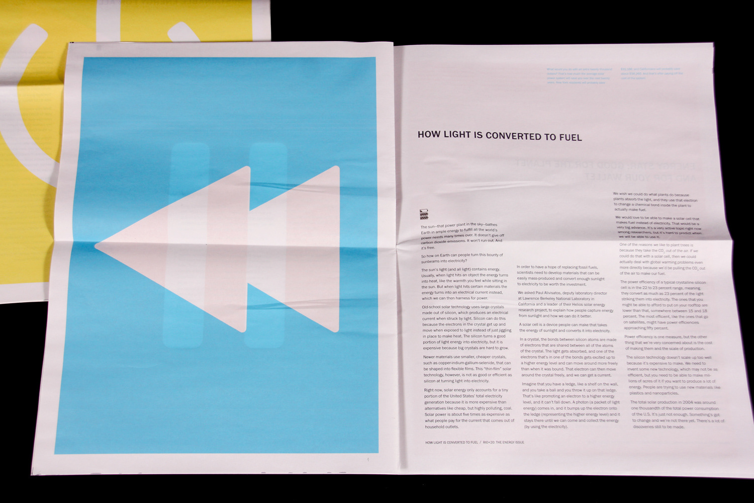
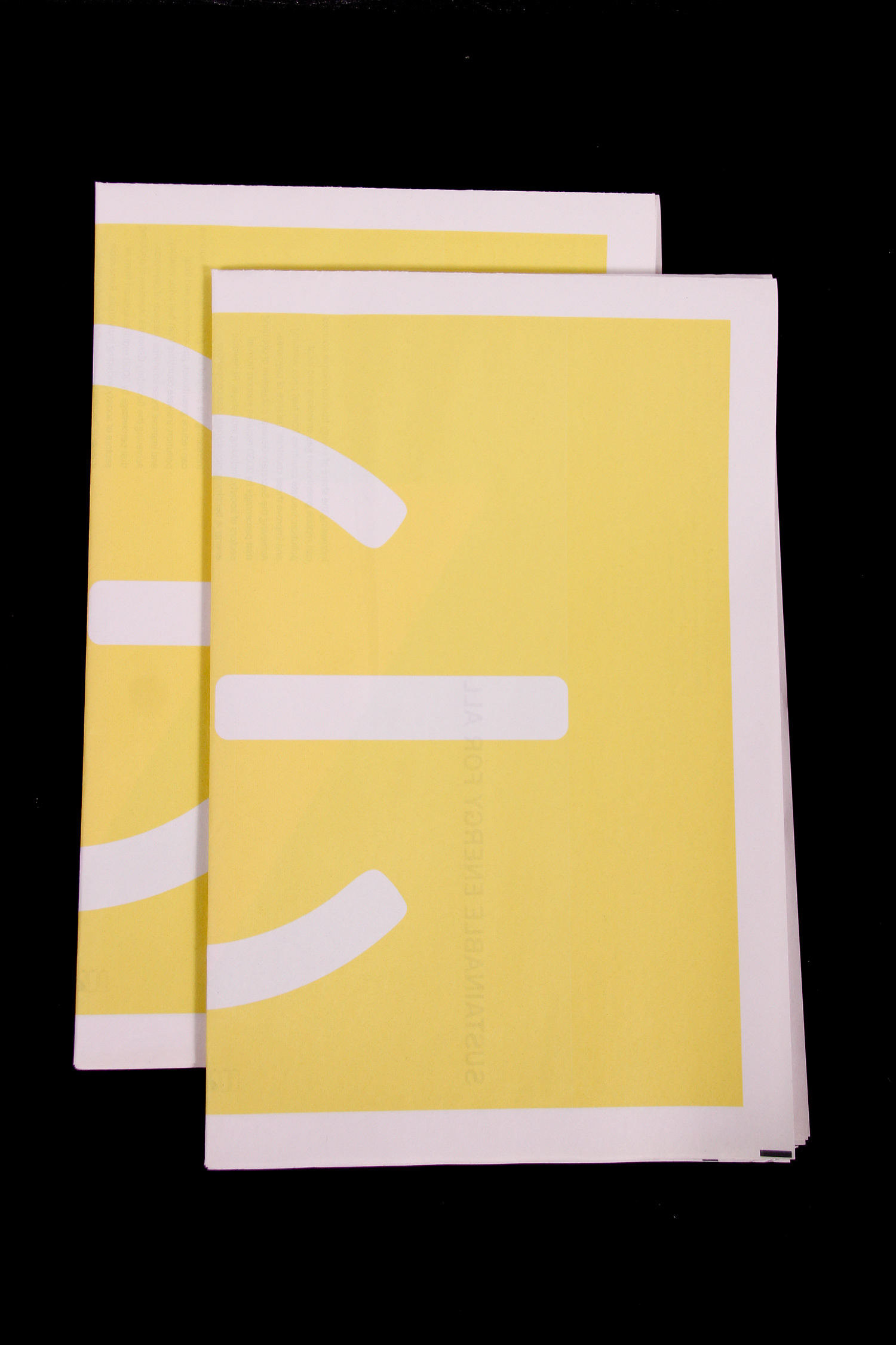
This is a publication design project involving multiple type structures and integrating imagery created around a concept. The subject chosen for the publication was Sustainable Energy. The concept I derived for the piece is power up. The symbol-based imagery not only reflects the energy we use to power everyday machines, but it also reflects the power of knowledge and what it can do to change the future of our planet. Articles within the newsletter relate topics of clean energy and how it can be attained on both a global and local level.
The symbols on each spread are universally recognized and represent power, play, fast-forward, pause, rewind, and stop. The folios of the piece are represented by a charging battery which increases in power with each article.
Franklin Gothic is a transitional sans serif typeface which possesses both humanist and geometric qualities. I felt this typeface as appropriate to serve the concept as it demonstrates both the mechanical and human qualities of power.
Rhode Island School of Design
Graphic Design Certificate Program, Division of Continuing Education
Dina Vincent, Instructor + Program Advisor
Graphic Design Certificate Program, Division of Continuing Education
Dina Vincent, Instructor + Program Advisor
Photos by Allan Millora Photography